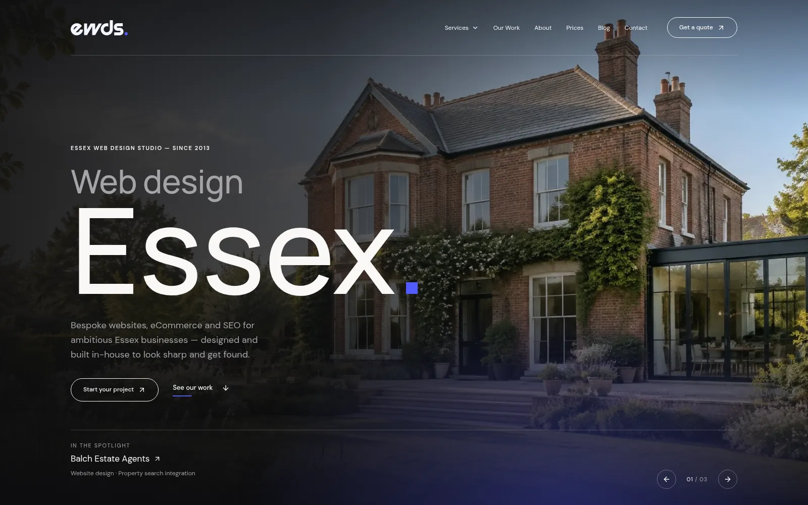
When you spend a decade advising people to make their work easier to find, eventually you have to take your own advice. Yesterday, on 4 November 2026, we did. The new Essex Web Design Studio website is live, and this is the story of why we rebuilt it, what we changed and what we learnt along the way.
It is a slightly odd feeling, publishing a post about your own website. Builders rarely write essays about their own kitchen. But our site is the one project we can talk about with complete freedom, and the reasons behind it apply to almost every business we speak to, so it seemed worth writing down.
Ten years of other people’s websites
For more than ten years we have designed and built websites for businesses across Essex. Estate agents in Chelmsford, a driving school in Braintree, compliance consultants, builders, kennels, florists and charities. Each one arrived with a different problem, and most of them sounded surprisingly similar once you got past the first coffee. People could not find the thing they needed. The phone number was buried. The best work was hidden three clicks deep, behind a menu nobody understood.
Our old website was built on WordPress with a commercial theme, and for a long time that was a sensible choice. A good theme gives you a working site quickly, with a page builder that lets you add a new page on a Tuesday afternoon without calling anyone. We built plenty of client sites the same way, and many of them are still doing their job perfectly well.
WordPress remains a genuine option, and we still recommend it. If a business needs several people editing content every week, publishing news, managing a shop or handing the site to an in-house marketer, WordPress has years of maturity behind it and a huge pool of people who know how to use it. Our WordPress maintenance work exists precisely because so many good websites run on it.
The trouble was our own site had drifted. Over the years the theme had been stretched to cover things it was never designed for. Every new page was a small negotiation with somebody else’s layout. The portfolio was a grid of pretty pictures with very little underneath them, and the route from “I need a website” to “here is how to get in touch” was longer than it needed to be. We were, in short, the cobbler with the worn shoes.
What the rebuild had to do
Before anyone opened a code editor, we wrote down what a visitor actually comes to our site to do. The list was short. Find out whether we build the kind of website they need. See real work for businesses like theirs. Get a sense of what it costs. Get in touch without filling in a form the length of a tax return.
Everything else followed from those four jobs. The services are now grouped so someone looking for web design in Essex, SEO or Google Ads management can see the right page from the menu without guessing which label we happened to choose. Our prices sit on their own page in plain sight, because people asked for them and hiding them never helped anyone. Support has its own home too, with managed hosting and maintenance explained in ordinary language.
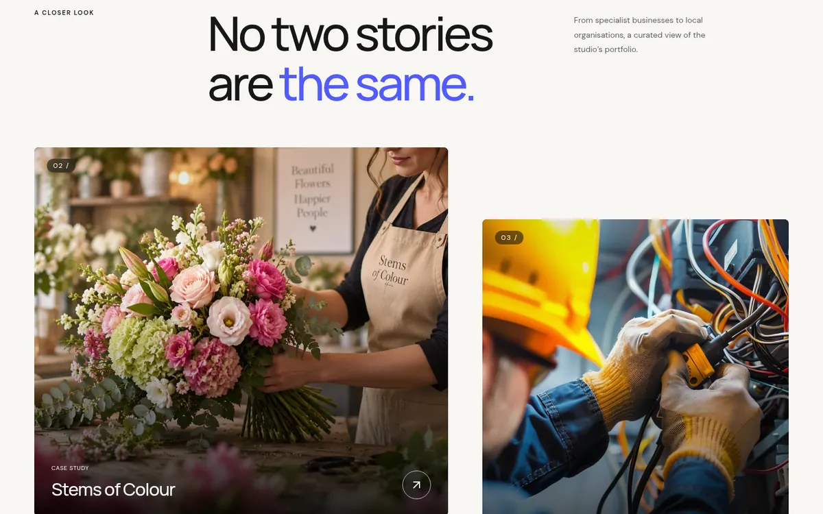
The biggest change is the portfolio. Each project in our work now leads to a proper case study that explains the decisions behind it. What the client needed, what we changed, and why the page looks the way it does. A screenshot shows you what a site looks like. A case study shows you how we think, which is the part you are actually hiring.
Three projects that shaped the new site
We did not want the new portfolio to be a showcase of adjectives. So we looked at what specific visitors were trying to achieve on the sites we had built, and wrote each case study around that task. Three projects in particular shaped how we think about the whole thing.
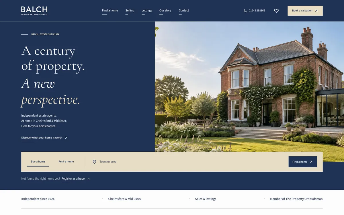
Balch Estate Agents
Balch has been an independent estate agency since 1924, based in Chelmsford and Mid Essex. People visiting an estate agent’s website have one overwhelming job, which is finding a home. The new Balch Estate Agents website is built around the way people actually look for one. Search, compare, save the ones you like, then ask to view. Listings come through from the agency’s Dezrez (Rezi) feed, so the homes on the site are the homes on the books.
Working on Balch sharpened our own thinking about journeys. If a visitor to an estate agent should be one tap from a property search, a visitor to a web design studio should be one tap from the work and one more from a conversation.
Mutlows Driving School
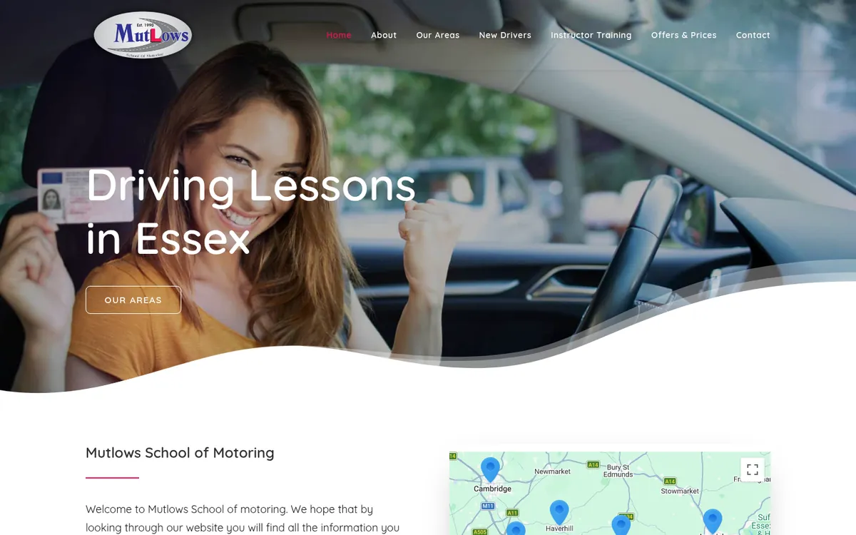
Mutlows Driving School came to us wanting to connect with more learners. We began with a full audit of their existing site and the journey a learner took through it. The goal was to make booking lessons simpler, put key information where people expect to find it and give the site a design that reflects the professionalism and scale of the Mutlows brand. Learners tend to check prices and lesson times on a phone, so an improved mobile experience was part of the brief from the start. You can read the full story in the Mutlows Driving School case study.
It is a useful reminder that the person on the other end of a website is usually busy. Nobody books driving lessons for fun. They want the prices, the areas covered and a way to get started, and every extra step is a reason to wander off and ring someone else.
Compliance Assistant
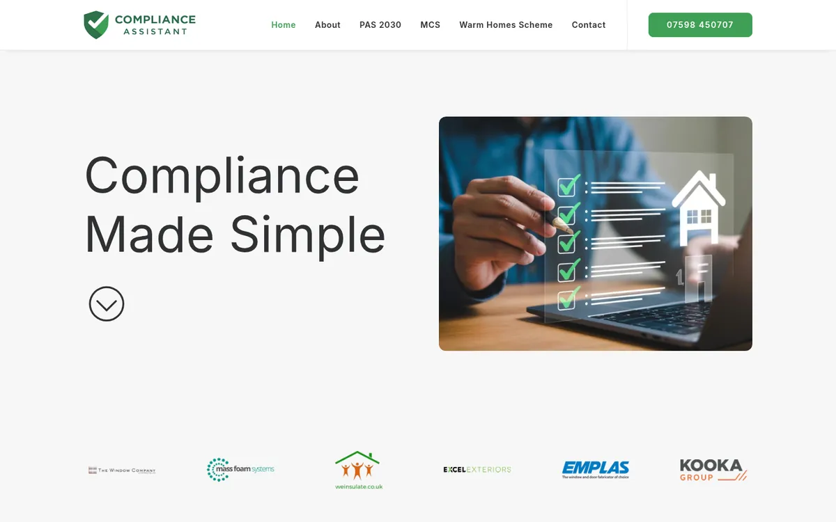
Compliance Assistant had a different challenge. Their work covers PAS 2030, MCS and wider compliance consultancy, which are subjects that can make a reader’s eyes glaze over by the second paragraph. The brief was a modern, structured website that explained technical services clearly and positioned the business as a trusted industry partner. The Compliance Assistant case study covers how we organised those services so a visitor can find their particular standard quickly and understand what help is on offer.
That project is a good example of something we wanted our own site to do better. Specialist businesses often know their subject so well they forget how it sounds to everybody else. Clear structure is a kindness to the reader, and it happens to be what search engines like too.
Why we chose React for our own site
The new site is built with React, using the TanStack Start framework. Pages are rendered on the server, so the HTML that arrives in a browser, or in front of a search engine, already contains the words, headings and links. React then takes over in the browser for the interactive parts, such as the menus, the project filters and the client carousel on the homepage.
The main reason was control. Our site needed a handful of bespoke pieces that a theme was never going to give us without a fight. A portfolio that can be filtered by industry, location and type of website. Case study pages that share one template but still let each project tell its own story. A services menu that works properly with a keyboard and a screen reader. In React each of those is a component we designed for this site, and once it exists it can be reused anywhere the same pattern appears.
Shared patterns turned out to be the quiet hero of the project. Headings, buttons, numbered steps, the type sizes on a phone and the spacing between sections all come from one set of rules. Change a rule once and every page follows. That makes the site more consistent for visitors and a great deal less tedious for us.
We should be honest about the trade-off. A site like ours suits a studio that writes code every day. It is a poor fit for a business where the office manager needs to add a new page before lunch. That is exactly why the right platform depends on who will be looking after the site, and why we still build on WordPress when editing is the priority.
Fast is a habit, and the framework is only the start
There is a popular idea that picking the right framework makes a website fast. It does not, on its own. We have seen slow sites built with the newest tools and quick ones running on software that was considered old a decade ago. Speed comes from a long list of small, unglamorous decisions, and most of them have nothing to do with the logo on the box.
Here is some of the work that went into the new site before launch.
- Responsive navigation. The desktop services menu and the full-screen mobile menu share one list of destinations, so they can never disagree about where a link goes. On phones the menu opens into sections you can expand, so nobody has to scroll past twenty links to find the one they want.
- Image delivery. Photos and screenshots are prepared at several sizes, so a phone downloads a phone-sized file and a large monitor gets a sharper one. Images further down the page wait until you scroll towards them, and every image carries its dimensions so the page does not jump around as it loads.
- Fonts and styles. Our two brand typefaces are hosted alongside the site instead of being fetched from a third party, and styling used by only one page now loads only on that page.
- Caching. Files whose names change whenever their contents change are cached for a long time. Pages themselves are always checked for freshness, so a visitor never sees yesterday’s version of something we fixed this morning.
- Launch checks. Before launch we screenshotted every page at five screen widths and went through them one by one, keeping a register of every defect we found until each one was fixed or consciously accepted. We also kept every old address working, so links people had saved or shared still arrive somewhere sensible.
None of this comes with a guaranteed score, and we would be wary of anyone who promised one. Speed tests vary from one run to the next and from one phone to another. What we can say is that each of those decisions removes a cost the visitor would otherwise pay, and that is the habit we try to bring to every project.
What we learnt rebuilding our own site
Being your own client is humbling. You discover that writing about yourself is harder than writing about anybody else. And you discover how many small decisions a client normally never sees, because we have quietly made them on their behalf.
A few lessons we are taking back into client work.
- Start with the visitor’s task. Every page on the new site began with a question about what somebody wants to do there. The pages that were hardest to write were the ones where we could not answer it.
- Show the decisions. People trust work more when they can see the thinking behind it. A case study that explains why is worth a dozen that only say wow.
- Keep the old addresses. A rebuild is a fresh start for the design, but the links people have bookmarked, shared or found in search deserve to keep working.
- Write it down. We kept notes on every decision as we went. When we later asked ourselves why something worked a certain way, the answer was already there.
What comes next for the blog
The new site gives us a better place to write, and we intend to use it. Over the coming months we plan to publish practical, plain English pieces on the questions clients ask us most. When WordPress is the right answer and when a bespoke React build makes more sense. How to plan a rebuild without losing the search visibility you already have. And how websites get found today, both through traditional search and through the AI assistants that more people are starting to ask for recommendations.
That last topic is moving quickly, so we will write about what we can observe and explain clearly, and we will leave the predictions to people with crystal balls. Clear structure, honest content and pages that answer real questions have always been the foundation of good SEO, and we expect that to stay true however the search box changes.
If you have a question you would like us to tackle, we would genuinely like to hear it.
Thinking about your own website?
Whether you need a new site, a rebuild of something that has drifted like ours had, or simply a second opinion on what you already have, we are happy to talk it through. You can browse our work, check our prices or get in touch directly, and we will give you an honest view of what would make the biggest difference.